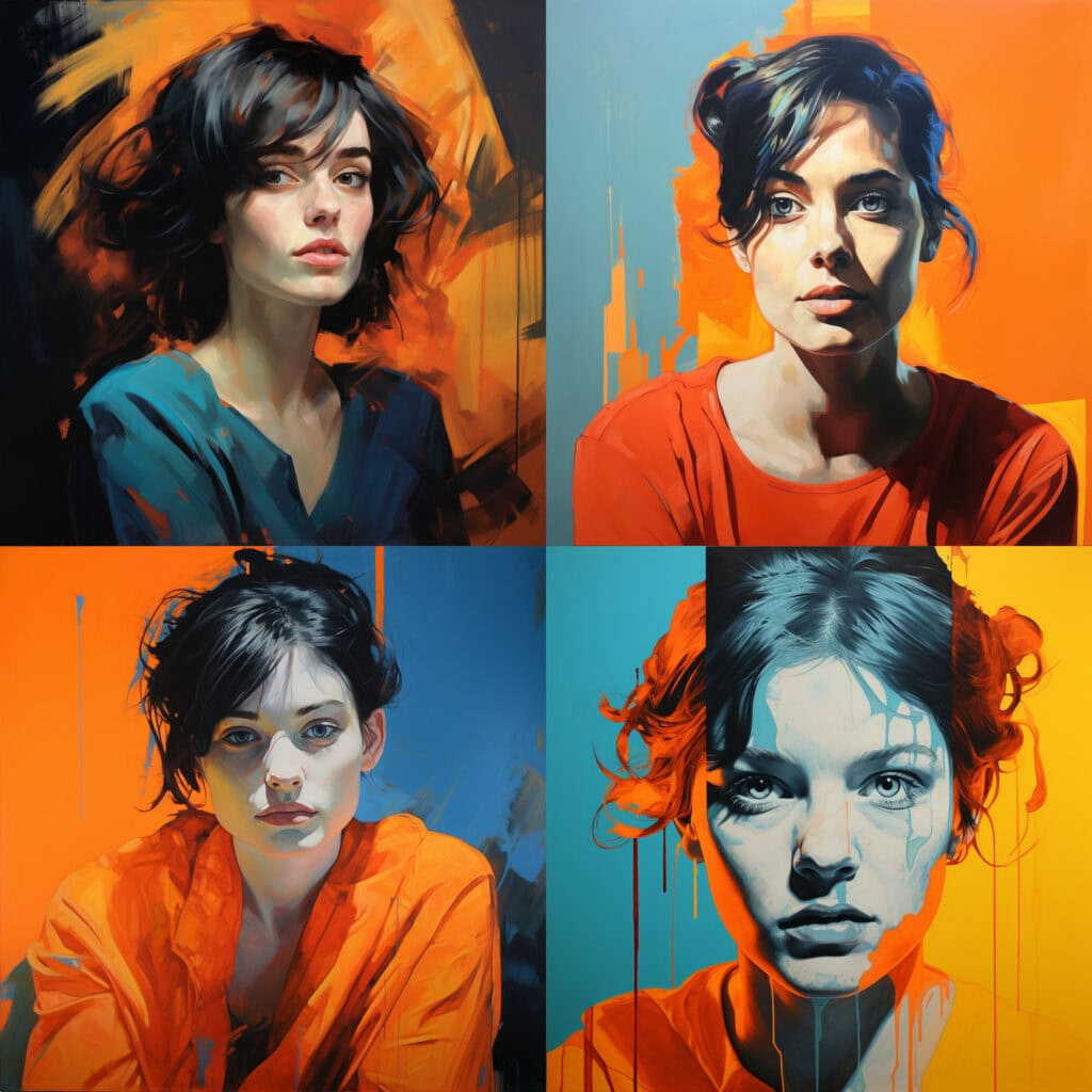
The Split Complementary color scheme integrates one primary color with two colors adjacent to its complementary color. It's a dynamic, high-contrast palette that incorporates diversity while maintaining color harmony. Often seen in web design and visual arts, this scheme captures attention without causing visual tension. It's also favored in advertising, owing to its eye-catching capacity while retaining a pleasing aesthetic.
Split Complementary Color Scheme in AI Art
When you add color schemes to an AI art prompt, you're telling the AI exactly what colors to use in the picture. It's like giving a painter a set of paint colors and asking them to create a painting using only those colors. This makes sure the AI uses the colors you want - making the picture look the way you imagine.
For example, when you add an 'Analogous Color Scheme' to an AI art prompt, you're guiding the AI to use colors that are close to each other on the color wheel. Think of it like picking neighbors from a color family. Similarly, if you include a 'Warm Color Scheme' in your AI art prompt, you're asking the AI to focus on colors like red, orange, and yellow. These colors are like a cozy fire or a bright sunset, creating a feeling of warmth and energy in the artwork. On the other hand, a 'Monochrome Color Scheme' means using various shades of just one color. It's like seeing the world through a single-color lens.
Demos and Samples
Below are AI-generated images with Split Complementary color scheme added to their prompts.
Like What You See?
Learn about the seven base prompts I use to create these images and how I use them to explore different style modifiers in AI art generators in my article: Style Modifiers & My Benchmark Prompts.


